We’ve released new functionality that makes your PromoSimple entry forms adapt to responsive websites, making it even easier for your entrants to participate in your promotions.
If your website is built in a responsive format, so that your content is rearranged and resized depending on the size of the browser window that visitors are using, the entry form will now also adapt to those specifications. The entry form will continue to utilize the standard or narrow width by default. However, if the space in which the entry form is placed becomes smaller than the set width, your entry form will adapt to ensure that no content is hidden from the user.
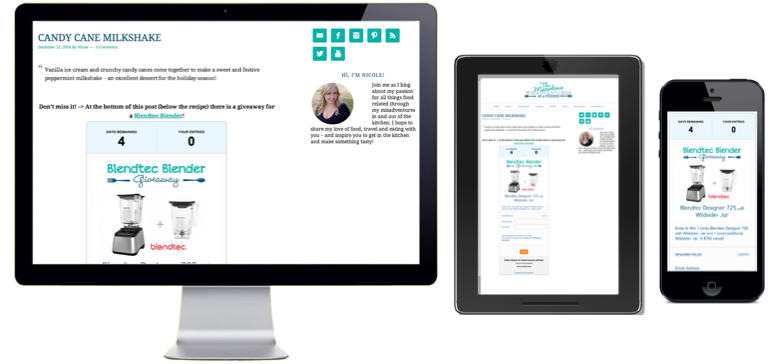
You can see a great example of a responsive website by visiting Foodie Misadventures. As you can see, if you decrease the width of your browser the website will adjust to these new dimensions. You can also see that the entry form will automatically change its width to ensure that you can still see the full form.
You can also test out and see how a responsive website functions by resizing your browser right now. Yes, the PromoSimple blog is a responsive site.
More than 60% of the adults in the United States own a smartphone
This feature is particularly important for users that are entering your campaigns via mobile devices. More than 60% of the adults in the United States own a smartphone and the percentage of website visits on mobile devices continues to rise. This means that the users accessing your promotions are more and more likely to be doing so on a mobile device. The new responsive entry form will ensure that this is a seamless and positive experience for your users.

1 Comment